
A New Look for Bazodee
At some point in every brand's lifetime comes a time where things need to be freshened up. This is usually to change how the brand is perceived, to make it more modern, more appealing, up-to-date, to represent a shift in direction, values, target market etc. or maybe just because the old look wasn't that good.
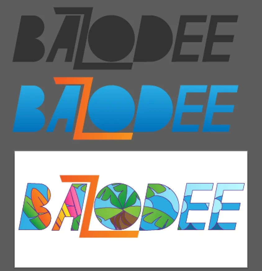
In the case of Bazodee, however, we were contacted because they wanted a redesigned logo to show brand evolution that would also be simpler, easier to print and customizable as well. It needed to communicate "fun" and "festival" -- aspects which are at the core of what fuels Bazodee.

The transformation of Bazodee
For the Bazodee logo we didn't use any pre-existing fonts, but instead created custom letter forms. To give the feeling of action, energy and fun, the letters are all tilted to 79º (why not 80? Because 1 degree changes a lot and 80º is more upright).


The letters also contain no closed counters (a counter is the area of a letter that is entirely or partially enclosed by a letter form or a symbol). This was done to maximize on the total surface area of the letters to allow for flexible customization.
"Why is the 'Z' different?"
Z is an interesting letter and it's not everyday that you get to work with it. So we made the Z the high energy element of the logo; different in colour, size and angle. It also remains static while the other letters are customized.

ICONIC
The Bazodee Icon is a play on phonetics; combining the sounds and shapes of B and Z so that you can't help but see it and start to say "Bazodee".
When it came to the Bazodee icon, the theme of carnival was requested. However, in an attempt to not limit the brand, this is where we ended up -- a shape that combines the two most prominent letters in the brand's name which can also change through the seasons to represent what Bazodee is covering.


Blooper Reel
As with every project, Bazodee's logo went through a few iterations before settling on the final version. The core concept was still the same but the executions varied.


What do you think
-about Bazodee's new look? Do you like it? love it? loathe it? Feel free to leave a comment telling us how you feel.